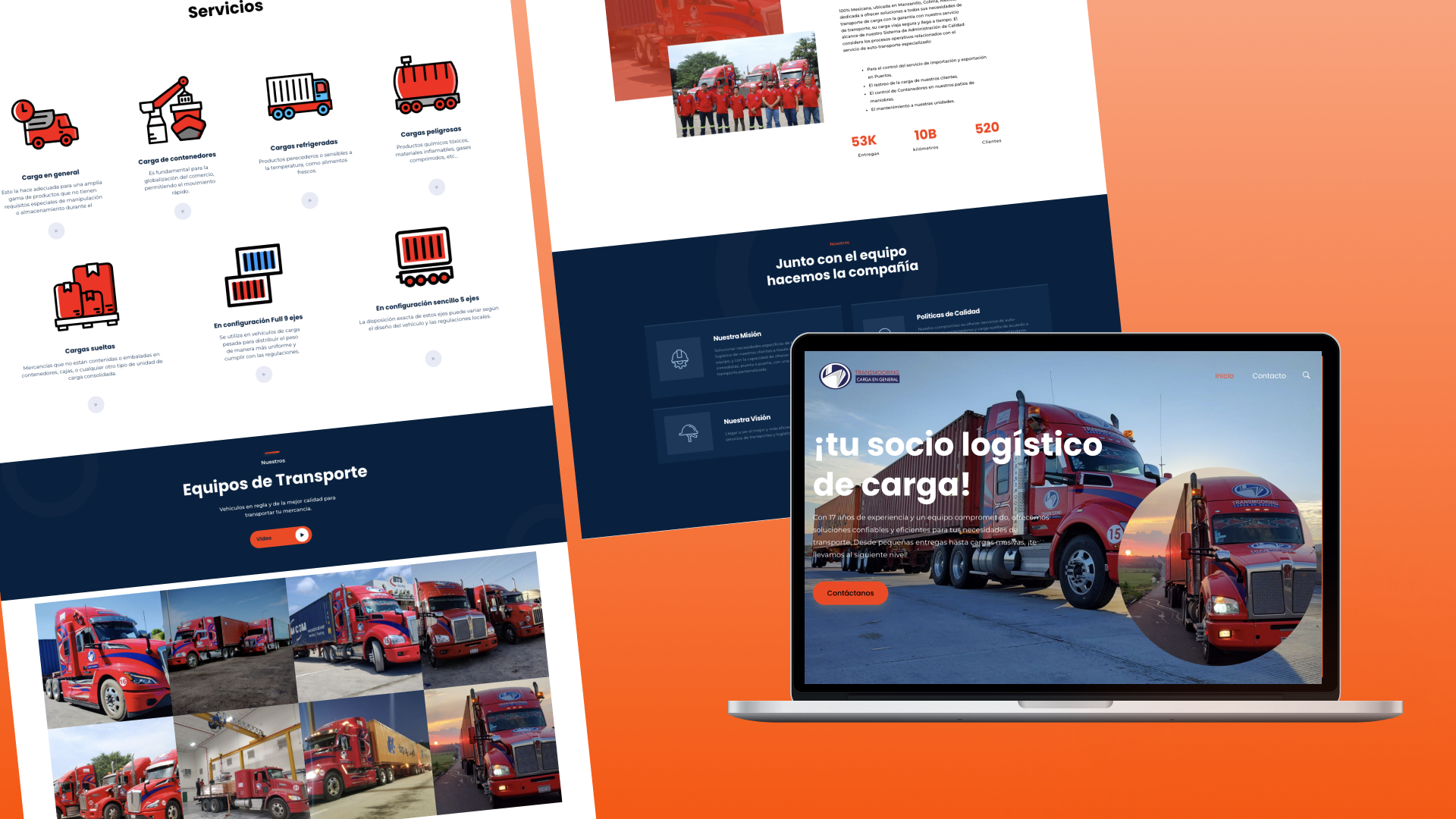
The process of working on the Transportes Mooring website was both engaging and challenging, requiring a structured approach and collaboration among all stakeholders. From the outset, the main goal was to create a website that not only reflected the company’s essence but also offered a seamless user experience, clear information, and an appealing design that facilitated navigation for customers.
Planning and Goal Definition Stage
The first stage of the project involved a series of meetings to fully understand the company’s objectives and how they wanted to position themselves in the market. This included interviews with company leaders to grasp their vision and mission, along with reviewing the specific transport services that Transportes Mooring provides. In this phase, we established the primary goals for the website: it needed to convey trust, be easy to navigate, and have a modern design that projected professionalism.
It was also decided that the website would include a dedicated section for each of the transportation services offered, with clear details on routes, estimated times, and rates. Additionally, we identified the importance of having a contact section where customers could send inquiries and receive quick responses.
Research and Competitor Analysis Stage
With well-defined objectives, we moved on to the research phase. At this stage, we studied other websites from similar companies to understand their strengths and weaknesses. This competitor analysis helped us identify areas where we could stand out and provide a better user experience. We also reviewed top transportation websites to observe best practices in terms of design and functionality, taking note of features that could be adapted to Transportes Mooring’s site.
Structuring and Interface Design
With all the gathered information, we began to develop the site’s structure. First, we created a detailed site map that specified all the pages the site would contain and how they would be interconnected. During this phase, we also designed the first wireframes to define the layout of each page and how visual and textual elements would be distributed.
For the interface design, we selected a color palette that reflected Transportes Mooring’s visual identity while being pleasing to the user’s eye. In addition, modern and readable fonts were chosen to convey professionalism and accessibility.
For images, we opted for high-quality photos showcasing the company’s vehicles and some common destinations. The images were carefully chosen to reflect the safety and trust that Transportes Mooring aims to convey to its clients.
Development and Coding
Once the design was approved, we moved on to the development phase. In this stage, the developers began building the site using technologies that ensured fast performance and a good user experience on various devices. We chose a responsive design to guarantee that the website would work perfectly on both desktop computers and mobile devices.
During development, we considered the importance of optimizing each page for search engines (SEO). This involved adding meta descriptions, optimizing images, and ensuring that the content included relevant keywords to improve visibility in search results.
Testing and Adjustments
After the development phase, we conducted extensive testing to ensure everything functioned correctly. We reviewed every link, form, and feature on the site to guarantee that users would not encounter any navigation issues. We also tested the site across different browsers and devices to make sure it was accessible to everyone.
In this phase, we received feedback from some users to make adjustments in the site’s usability. These comments were invaluable and helped us make a few tweaks to further improve the user experience.
Launch and Monitoring
Finally, we launched the website and began a monitoring phase. This allowed us to identify any technical issues that might arise after launch. We also implemented analytics tools to monitor site traffic and observe how users interacted with the site. With this information, we can continue to optimize the site and improve its performance over time.
Conclusion
The process of working on the Transportes Mooring website was an enriching experience that allowed us to apply skills in design, development, and analysis. Thanks to a structured approach and ongoing collaboration, we created a website that not only meets the company’s objectives but also enhances the customer experience by providing an intuitive and efficient platform.

